3.5. 3D plotting with Mayavi
Author: Gaël Varoquaux
Tip
Mayavi is an interactive 3D plotting package. matplotlib can also do simple 3D plotting, but Mayavi relies on a more powerful engine ( VTK ) and is more suited to displaying large or complex data.
Chapters contents
3.5.1. Mlab: the scripting interface
The mayavi.mlab module provides simple plotting functions to apply
to numpy arrays, similar to matplotlib or matlab’s plotting interface.
Try using them in IPython, by starting IPython with the switch
--gui=wx.
3.5.1.1. 3D plotting functions
Points
Hint
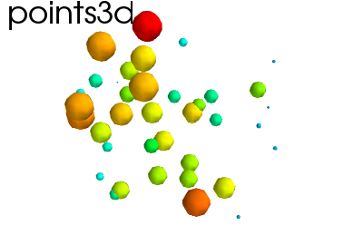
Points in 3D, represented with markers (or “glyphs”) and optionaly different sizes.
x, y, z, value = np.random.random((4, 40))
mlab.points3d(x, y, z, value)
Lines
Hint
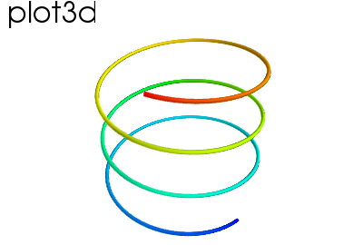
A line connecting points in 3D, with optional thickness and varying color.
mlab.clf()  # Clear the figure
t = np.linspace(0, 20, 200)
mlab.plot3d(np.sin(t), np.cos(t), 0.1*t, t)
Elevation surface
Hint
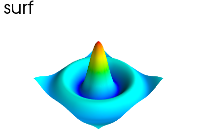
A surface given by its elevation, coded as a 2D array
mlab.clf()
x, y = np.mgrid[-10:10:100j, -10:10:100j]
r = np.sqrt(x**2 + y**2)
z = np.sin(r)/r
mlab.surf(z, warp_scale='auto')
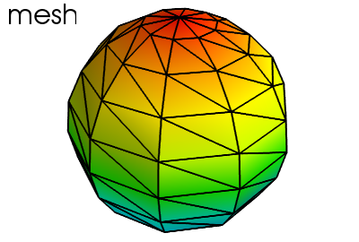
Arbitrary regular mesh
Hint
A surface mesh given by x, y, z positions of its node points
mlab.clf()
phi, theta = np.mgrid[0:np.pi:11j, 0:2*np.pi:11j]
x = np.sin(phi) * np.cos(theta)
y = np.sin(phi) * np.sin(theta)
z = np.cos(phi)
mlab.mesh(x, y, z)
mlab.mesh(x, y, z, representation='wireframe', color=(0, 0, 0))
Note
A surface is defined by points connected to form triangles or
polygones. In mayavi.mlab.surf() and mayavi.mlab.mesh(),
the connectivity is implicity given by the layout of the arrays. See also
mayavi.mlab.triangular_mesh().
Our data is often more than points and values: it needs some connectivity information
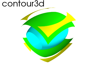
Volumetric data
Hint
If your data is dense in 3D, it is more difficult to display. One option is to take iso-contours of the data.
mlab.clf()
x, y, z = np.mgrid[-5:5:64j, -5:5:64j, -5:5:64j]
values = x*x*0.5 + y*y + z*z*2.0
mlab.contour3d(values)
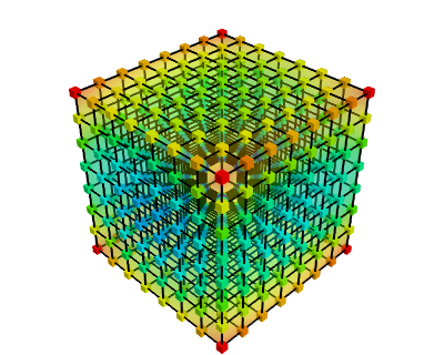
This function works with a regular orthogonal grid: the value array is a 3D array that gives the shape of the grid.
3.5.1.2. Figures and decorations
Figure management
Tip
Here is a list of functions useful to control the current figure
| Get the current figure: | mlab.gcf() |
| Clear the current figure: | mlab.clf() |
| Set the current figure: | mlab.figure(1, bgcolor=(1, 1, 1), fgcolor=(0.5, 0.5, 0.5) |
| Save figure to image file: | mlab.savefig(‘foo.png’, size=(300, 300)) |
| Change the view: | mlab.view(azimuth=45, elevation=54, distance=1.) |
Changing plot properties
Tip
In general, many properties of the various objects on the figure can be changed. If these visualization are created via mlab functions, the easiest way to change them is to use the keyword arguments of these functions, as described in the docstrings.
Example docstring: mlab.mesh
Plots a surface using grid-spaced data supplied as 2D arrays.
Function signatures:
mesh(x, y, z, ...)
x, y, z are 2D arrays, all of the same shape, giving the positions of the vertices of the surface. The connectivity between these points is implied by the connectivity on the arrays.
For simple structures (such as orthogonal grids) prefer the surf function, as it will create more efficient data structures.
Keyword arguments:
color: the color of the vtk object. Overides the colormap, if any, when specified. This is specified as a triplet of float ranging from 0 to 1, eg (1, 1, 1) for white. colormap: type of colormap to use. extent: [xmin, xmax, ymin, ymax, zmin, zmax] Default is the x, y, z arrays extents. Use this to change the extent of the object created. figure: Figure to populate. line_width: The with of the lines, if any used. Must be a float. Default: 2.0 mask: boolean mask array to suppress some data points. mask_points: If supplied, only one out of ‘mask_points’ data point is displayed. This option is usefull to reduce the number of points displayed on large datasets Must be an integer or None. mode: the mode of the glyphs. Must be ‘2darrow’ or ‘2dcircle’ or ‘2dcross’ or ‘2ddash’ or ‘2ddiamond’ or ‘2dhooked_arrow’ or ‘2dsquare’ or ‘2dthick_arrow’ or ‘2dthick_cross’ or ‘2dtriangle’ or ‘2dvertex’ or ‘arrow’ or ‘cone’ or ‘cube’ or ‘cylinder’ or ‘point’ or ‘sphere’. Default: sphere name: the name of the vtk object created. representation: the representation type used for the surface. Must be ‘surface’ or ‘wireframe’ or ‘points’ or ‘mesh’ or ‘fancymesh’. Default: surface resolution: The resolution of the glyph created. For spheres, for instance, this is the number of divisions along theta and phi. Must be an integer. Default: 8 scalars: optional scalar data. scale_factor: scale factor of the glyphs used to represent the vertices, in fancy_mesh mode. Must be a float. Default: 0.05 scale_mode: the scaling mode for the glyphs (‘vector’, ‘scalar’, or ‘none’). transparent: make the opacity of the actor depend on the scalar. tube_radius: radius of the tubes used to represent the lines, in mesh mode. If None, simple lines are used. tube_sides: number of sides of the tubes used to represent the lines. Must be an integer. Default: 6 vmax: vmax is used to scale the colormap If None, the max of the data will be used vmin: vmin is used to scale the colormap If None, the min of the data will be used
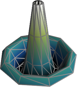
Example:
In [1]: import numpy as np

In [2]: r, theta = np.mgrid[0:10, -np.pi:np.pi:10j]

In [3]: x = r * np.cos(theta)

In [4]: y = r * np.sin(theta)

In [5]: z = np.sin(r)/r

In [6]: from mayavi import mlab

In [7]: mlab.mesh(x, y, z, colormap='gist_earth', extent=[0, 1, 0, 1, 0, 1])
Out[7]: <mayavi.modules.surface.Surface object at 0xde6f08c>

In [8]: mlab.mesh(x, y, z, extent=[0, 1, 0, 1, 0, 1],
   ...: representation='wireframe', line_width=1, color=(0.5, 0.5, 0.5))
Out[8]: <mayavi.modules.surface.Surface object at 0xdd6a71c>
Decorations
Tip
Different items can be added to the figure to carry extra information, such as a colorbar or a title.
In [9]: mlab.colorbar(Out[7], orientation='vertical')
Out[9]: <tvtk_classes.scalar_bar_actor.ScalarBarActor object at 0xd897f8c>

In [10]: mlab.title('polar mesh')
Out[10]: <enthought.mayavi.modules.text.Text object at 0xd8ed38c>

In [11]: mlab.outline(Out[7])
Out[11]: <enthought.mayavi.modules.outline.Outline object at 0xdd21b6c>

In [12]: mlab.axes(Out[7])
Out[12]: <enthought.mayavi.modules.axes.Axes object at 0xd2e4bcc>
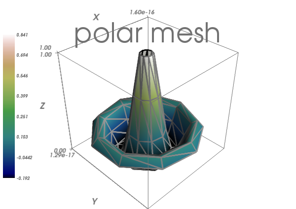
Warning
extent: If we specified extents for a plotting object, mlab.outline’ and `mlab.axes don’t get them by default.
3.5.2. Interactive work
Tip
The quickest way to create beautiful visualization with Mayavi is probably to interactively tweak the various settings.
3.5.2.1. The “pipeline dialog”
Click on the ‘Mayavi’ button in the scene, and you can control properties of objects with dialogs.
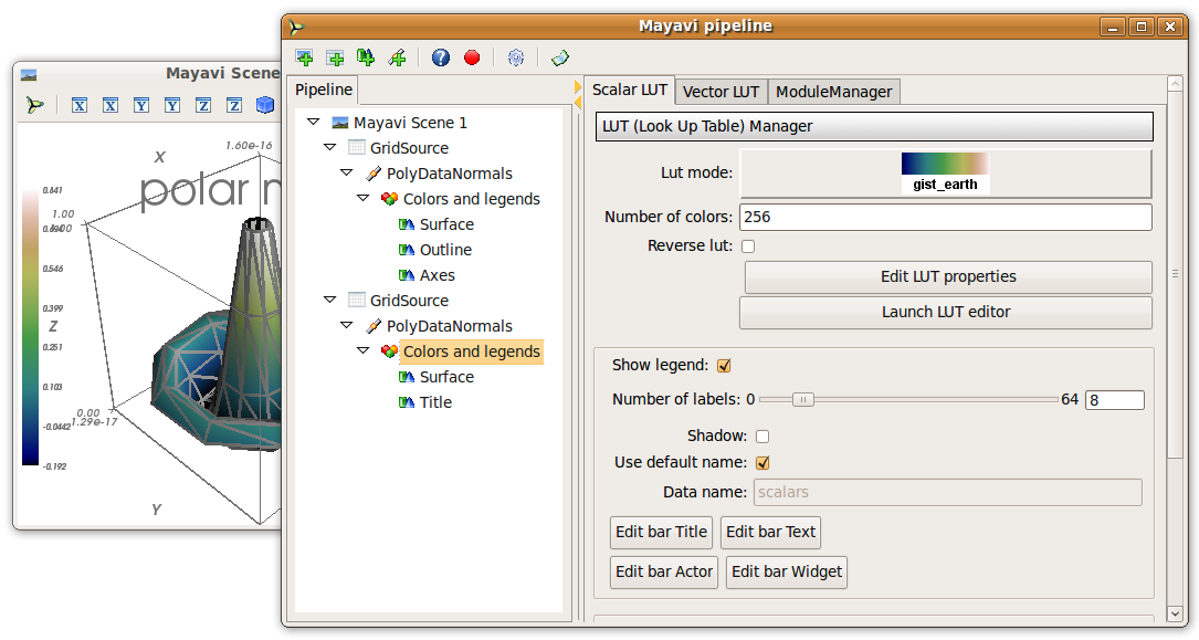
- Set the background of the figure in the Mayavi Scene node
- Set the colormap in the Colors and legends node
- Right click on the node to add modules or filters
3.5.2.2. The script recording button
To find out what code can be used to program these changes, click on the red button as you modify those properties, and it will generate the corresponding lines of code.
3.5.3. Slicing and dicing data: sources, modules and filters
3.5.3.1. An example: inspecting magnetic fields
Suppose we are simulating the magnetic field generated by Helmholtz coils.
The examples/compute_field.py script does this computation
and gives you a B array, that is (3 x n), where the first axis is the
direction of the field (Bx, By, Bz), and the second axis the index number
of the point. Arrays X, Y and Z give the positions of these data
points.
Excercise
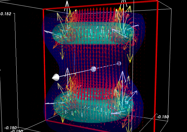
Visualize this field. Your goal is to make sure that the simulation code is correct.
Suggestions
- If you compute the norm of the vector field, you can apply an isosurface to it.
- using
mayavi.mlab.quiver3d()you can plot vectors. You can also use the ‘masking’ options (in the GUI) to make the plot a bit less dense.
3.5.3.2. Different views on data: sources and modules
Tip
As we see above, it may be desirable to look at the same data in different ways.
Mayavi visualization are created by loading the data in a data
source and then displayed on the screen using modules.
This can be seen by looking at the “pipeline” view. By right-clicking on the nodes of the pipeline, you can add new modules.
Quiz
Why is it not possible to add a VectorCutPlane to the vectors
created by mayavi.mlab.quiver3d()?
Different sources: scatters and fields
Tip
Data comes in different descriptions.
- A 3D block of regularly-spaced value is structured: it is easy to know how one measurement is related to another neighboring and how to continuously interpolate between these. We can call such data a field, borrowing from terminology used in physics, as it is continuously defined in space.
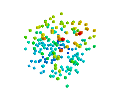
- A set of data points measured at random positions in a random order gives rise to much more difficult and ill-posed interpolation problems: the data structure itself does not tell us what are the neighbors of a data point. We call such data a scatter.
 |
 |
|---|---|
| Unstructured and unconnected data: a scatter | Structured and connected data: a field |
| mlab.points3d, mlab.quiver3d | mlab.contour3d |
Data sources corresponding to scatters can be created with
mayavi.mlab.pipeline.scalar_scatter() or
mayavi.mlab.pipeline.vector_scatter(); field data sources can be
created with mlab.pipeline.scalar_field() or
mlab.pipeline.vector_field().
Exercice:
- Create a contour (for instance of the magnetic field norm) by using one of those functions and adding the right module by clicking on the GUI dialog.
- Create the right source to apply a ‘vector_cut_plane’ and reproduce the picture of the magnetic field shown previously.
Note that one of the difficulties is providing the data in the right form (number of arrays, shape) to the functions. This is often the case with real-life data.
See also
Sources are described in details in the Mayavi manual.
Transforming data: filters
If you create a vector field, you may want to visualize the
iso-contours of its magnitude. But the isosurface module can only be
applied to scalar data, and not vector data. We can use a filter,
ExtractVectorNorm to add this scalar value to the vector field.
Filters apply a transformation to data, and can be added between sources and modules
Excercice
Using the GUI, add the ExtractVectorNorm filter to display iso-contours of the field magnitude.
mlab.pipeline: the scripting layer
The mlab scripting layer builds pipelines for you. You can reproduce
these pipelines programmatically with the mlab.pipeline interface:
each step has a corresponding mlab.pipeline function (simply convert
the name of the step to lower-case underscore-separated:
ExtractVectorNorm gives extract_vector_norm). This function takes as an
argument the node that it applies to, as well as optional parameters, and
returns the new node.
For example, iso-contours of the magnitude are coded as:
mlab.pipeline.iso_surface(mlab.pipeline.extract_vector_norm(field),
                          contours=[0.1*Bmax, 0.4*Bmax],
                          opacity=0.5)

Excercice
Using the mlab.pipeline interface, generate a complete visualization, with iso-contours of the field magnitude, and a vector cut plane.
(click on the figure for a solution)
3.5.4. Animating the data
Tip
To make movies, or interactive application, you may want to change the data represented on a given visualization.
If you have built a visualization, using the mlab plotting functions,
or the mlab.pipeline function, we can update the data by assigning
new values to the mlab_source attributes
x , y , z = np.ogrid[-5:5:100j ,-5:5:100j, -5:5:100j]
scalars = np.sin(x * y * z) / (x * y * z)

iso = mlab.contour3d(scalars, transparent=True, contours=[0.5])
for i in range(1, 20):
    scalars = np.sin(i * x * y * z) /(x * y * z)
    iso.mlab_source.scalars = scalars
See also
More details in the Mayavi documentation
Event loops
For the interaction with the user (for instance changing the view with the mouse), Mayavi needs some time to process these events. The for loop above prevents this. The Mayavi documentation details a workaround
3.5.5. Making interactive dialogs
It is very simple to make interactive dialogs with Mayavi using the Traits library (see the dedicated chapter Traits: building interactive dialogs).
3.5.5.1. A simple dialog
from traits.api import HasTraits, Instance
from traitsui.api import View, Item, HGroup
from mayavi.core.ui.api import SceneEditor, MlabSceneModel

def curve(n_turns):
    "The function creating the x, y, z coordinates needed to plot"
    phi = np.linspace(0, 2*np.pi, 2000)
    return [np.cos(phi) * (1 + 0.5*np.cos(n_turns*phi)),
            np.sin(phi) * (1 + 0.5*np.cos(n_turns*phi)),
            0.5*np.sin(n_turns*phi)]


class Visualization(HasTraits):
    "The class that contains the dialog"
    scene   = Instance(MlabSceneModel, ())

    def __init__(self):
        HasTraits.__init__(self)
        x, y, z = curve(n_turns=2)
        # Populating our plot
        self.plot = self.scene.mlab.plot3d(x, y, z)

    # Describe the dialog
    view = View(Item('scene', height=300, show_label=False,
                    editor=SceneEditor()),
                HGroup('n_turns'), resizable=True)

# Fire up the dialog
Visualization().configure_traits()
Tip
Let us read a bit the code above (examples/mlab_dialog.py).
First, the curve function is used to compute the coordinate of the
curve we want to plot.
Second, the dialog is defined by an object inheriting from HasTraits,
as it is done with Traits. The important point here
is that a Mayavi scene is added as a specific Traits attribute
(Instance). This is important for embedding it in the dialog.
The view of this dialog is defined by the view attribute of the
object. In the init of this object, we populate the 3D scene with a
curve.
Finally, the configure_traits method creates the dialog and starts
the event loop.
See also
There are a few things to be aware of when doing dialogs with Mayavi. Please read the Mayavi documentation
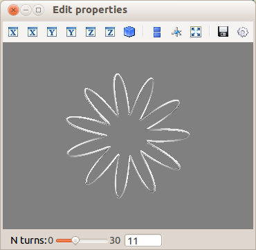
3.5.5.2. Making it interactive
We can combine the Traits events handler
with the mlab_source to modify the visualization with the dialog.
We will enable the user to vary the n_turns parameter in the definition
of the curve. For this, we need:
- to define an
n_turnsattribute on our visualization object, so that it can appear in the dialog. We use aRangetype. - to wire modification of this attribute to a recomputation of the curve.
For this, we use the
on_traits_changedecorator.
from traits.api import Range, on_trait_change

class Visualization(HasTraits):
    n_turns = Range(0, 30, 11)
    scene   = Instance(MlabSceneModel, ())

    def __init__(self):
        HasTraits.__init__(self)
        x, y, z = curve(self.n_turns)
        self.plot = self.scene.mlab.plot3d(x, y, z)

    @on_trait_change('n_turns')
    def update_plot(self):
        x, y, z = curve(self.n_turns)
        self.plot.mlab_source.set(x=x, y=y, z=z)

    view = View(Item('scene', height=300, show_label=False,
                    editor=SceneEditor()),
                HGroup('n_turns'), resizable=True)

# Fire up the dialog
Visualization().configure_traits()
Tip
Full code of the example: examples/mlab_dialog.py.
3.5.6. Putting it together
Exercise
Using the code from the magnetic field simulation, create a dialog that enable to move the 2 coils: change their parameters.
Hint: to define a dialog entry for a vector of dimension 3
direction = Array(float, value=(0, 0, 1), cols=3, shape=(3,))
You can look at the example_coil_application.py to see a full-blown application for coil design in 270 lines of code.
