
3.6.9.13. Simple visualization and classification of the digits dataset
Plot the first few samples of the digits dataset and a 2D representation built using PCA, then do a simple classification
from sklearn.datasets import load_digits
digits = load_digits()
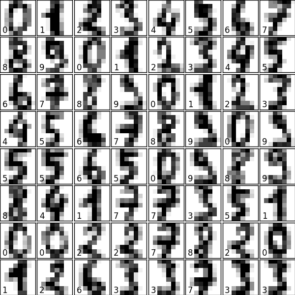
Plot the data: images of digits
Each data in a 8x8 image
from matplotlib import pyplot as plt
fig = plt.figure(figsize=(6, 6))  # figure size in inches
fig.subplots_adjust(left=0, right=1, bottom=0, top=1, hspace=0.05, wspace=0.05)

for i in range(64):
    ax = fig.add_subplot(8, 8, i + 1, xticks=[], yticks=[])
    ax.imshow(digits.images[i], cmap=plt.cm.binary, interpolation='nearest')
    # label the image with the target value
    ax.text(0, 7, str(digits.target[i]))
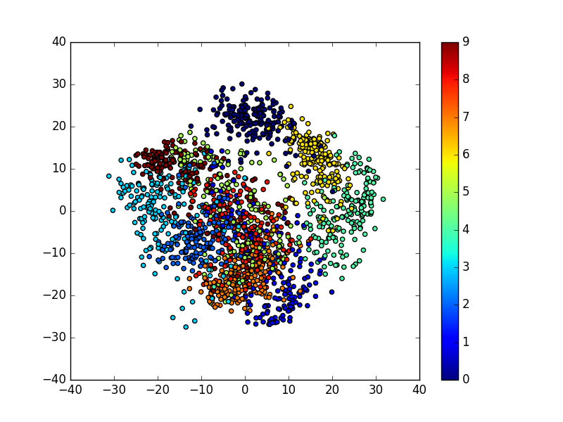
Plot a projection on the 2 first principal axis
plt.figure()

from sklearn.decomposition import PCA
pca = PCA(n_components=2)
proj = pca.fit_transform(digits.data)
plt.scatter(proj[:, 0], proj[:, 1], c=digits.target)
plt.colorbar()
Classify with Gaussian naive Bayes
from sklearn.naive_bayes import GaussianNB
from sklearn.model_selection import train_test_split
# split the data into training and validation sets
X_train, X_test, y_train, y_test = train_test_split(digits.data, digits.target)
# train the model
clf = GaussianNB()
clf.fit(X_train, y_train)
# use the model to predict the labels of the test data
predicted = clf.predict(X_test)
expected = y_test
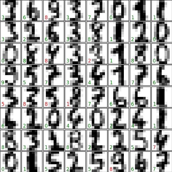
# Plot the prediction
fig = plt.figure(figsize=(6, 6)) # figure size in inches
fig.subplots_adjust(left=0, right=1, bottom=0, top=1, hspace=0.05, wspace=0.05)
# plot the digits: each image is 8x8 pixels
for i in range(64):
ax = fig.add_subplot(8, 8, i + 1, xticks=[], yticks=[])
ax.imshow(X_test.reshape(-1, 8, 8)[i], cmap=plt.cm.binary,
interpolation='nearest')
# label the image with the target value
if predicted[i] == expected[i]:
ax.text(0, 7, str(predicted[i]), color='green')
else:
ax.text(0, 7, str(predicted[i]), color='red')
Quantify the performance
First print the number of correct matches
matches = (predicted == expected)
print(matches.sum())
Out:
402
The total number of data points
print(len(matches))
Out:
450
And now, the ration of correct predictions
matches.sum() / float(len(matches))
Print the classification report
from sklearn import metrics
print(metrics.classification_report(expected, predicted))
Out:
precision    recall  f1-score   support

          0       0.98      1.00      0.99        53
          1       0.82      0.88      0.85        42
          2       0.90      0.91      0.90        57
          3       0.94      0.76      0.84        38
          4       0.97      0.85      0.91        40
          5       0.93      0.96      0.95        45
          6       0.95      0.97      0.96        40
          7       0.78      0.98      0.87        51
          8       0.78      0.87      0.82        46
          9       1.00      0.66      0.79        38

avg / total       0.90      0.89      0.89       450
Print the confusion matrix
print(metrics.confusion_matrix(expected, predicted))

plt.show()
Out:
[[53  0  0  0  0  0  0  0  0  0]
 [ 0 37  1  0  0  0  2  1  1  0]
 [ 0  2 52  0  1  0  0  0  2  0]
 [ 0  0  3 29  0  1  0  1  4  0]
 [ 0  1  0  0 34  0  0  4  1  0]
 [ 0  0  0  1  0 43  0  0  1  0]
 [ 0  0  0  0  0  1 39  0  0  0]
 [ 0  0  0  0  0  1  0 50  0  0]
 [ 0  4  0  0  0  0  0  2 40  0]
 [ 1  1  2  1  0  0  0  6  2 25]]
Total running time of the script: ( 0 minutes 5.056 seconds)