
Note
Go to the end to download the full example code or to run this example in your browser via JupyterLite or Binder.
An epidemiological study: Predicting 5-year mortality#
The NHANES study has been runs dietary interviews and blood tests for several decade to measure the nutritional status of U.S. adults and children and relate it to health.
Here we use models to predict 5-year mortality from the NHANES covariates. We use both a simple model (a linear, that is a classic tool in epidemiology) and a more flexible machine learning model.
We show how to understand these models within the context of our specific question: mortality prediction. For this, we inspect features importance, and look at partial dependence plots to understand how the model uses covariates to predict.
Predicting a single yes/no outcome at a fixed horizon (here, 5 years) like this is itself a common way of side-stepping censoring - the “finite-horizon” approach revisited, and contrasted with full survival analysis, in the last notebook.
Learning objectives and take home messages#
This notebook introduces a dataset, and the finite-horizon approach to a time-to-event question - both used as a baseline for the later notebook on survival analysis.
It can be skipped unless you have a particular interest in this type of datasets.
Load NHANES 5-year-outcome dataset#
This dataset was built from the NHANES study:
Covariates used: ['age', 'sex', 'race_eth', 'education', 'bmi', 'waist_cm', 'systolic_bp_mmhg', 'diastolic_bp_mmhg', 'EVER_SMOKED']

5-year mortality rate: 0.07133276161576181
Model fitting and prediction#
Train / test split#
Before fitting models, we split train and test data, in order to have untouched hold-out data (“test”) to evaluate the model. We stratify the split, the outcome is rare (~7%).
from sklearn.model_selection import train_test_split

X_train, X_test, y_train, y_test = train_test_split(
    X, y, test_size=0.2, stratify=y, random_state=0
)
Fit a linear model: logistic regression#
We use a LogisticRegression from scikit-learn, but wrap it in a
tabular_pipeline from skrub that does some data preparation.
from sklearn.linear_model import LogisticRegression
from skrub import tabular_pipeline

model_linear = tabular_pipeline(LogisticRegression())
model_linear.fit(X_train, y_train)
Pipeline(steps=[('tablevectorizer',
                 TableVectorizer(datetime=DatetimeEncoder(periodic_encoding='spline'))),
                ('simpleimputer', SimpleImputer(add_indicator=True)),
                ('squashingscaler', SquashingScaler(max_absolute_value=5)),
                ('logisticregression', LogisticRegression())])
In a Jupyter environment, please rerun this cell to show the HTML representation or trust the notebook. On GitHub, the HTML representation is unable to render, please try loading this page with nbviewer.org.
Parameters
Fitted attributes
Parameters
Fitted attributes
['age', 'education', 'bmi', 'waist_cm', 'systolic_bp_mmhg', 'diastolic_bp_mmhg']
Parameters
Parameters
['sex', 'race_eth', 'EVER_SMOKED']
Parameters
Parameters
17 features
| age |
| sex_M |
| race_eth_Mexican American |
| race_eth_Non-Hispanic Black |
| race_eth_Non-Hispanic White |
| race_eth_Other Hispanic |
| race_eth_Other race - including multi-racial |
| education |
| bmi |
| waist_cm |
| systolic_bp_mmhg |
| diastolic_bp_mmhg |
| EVER_SMOKED_don't know |
| EVER_SMOKED_no |
| EVER_SMOKED_refused |
| EVER_SMOKED_yes |
| EVER_SMOKED_nan |
Parameters
Fitted attributes
| Name | Type | Value |
|---|---|---|
|
feature_names_in_
feature_names_in_: ndarray of shape (`n_features_in_`,) Names of features seen during :term:`fit`. Defined only when `X` has feature names that are all strings. .. versionadded:: 1.0 |
ndarray[object](17,) | ['age','sex_M','race_eth_Mexican American',...,'EVER_SMOKED_refused', 'EVER_SMOKED_yes','EVER_SMOKED_nan'] |
|
indicator_
indicator_: :class:`~sklearn.impute.MissingIndicator` Indicator used to add binary indicators for missing values. `None` if `add_indicator=False`. |
MissingIndicator | MissingIndica..._on_new=False) |
|
n_features_in_
n_features_in_: int Number of features seen during :term:`fit`. .. versionadded:: 0.24 |
int | 17 |
|
statistics_
statistics_: array of shape (n_features,) The imputation fill value for each feature. Computing statistics can result in `np.nan` values. During :meth:`transform`, features corresponding to `np.nan` statistics will be discarded. |
ndarray[float64](17,) | [47.25, 0.48, 0.19,..., 0. , 0.43, 0.07] |
22 features
| age |
| sex_M |
| race_eth_Mexican American |
| race_eth_Non-Hispanic Black |
| race_eth_Non-Hispanic White |
| race_eth_Other Hispanic |
| race_eth_Other race - including multi-racial |
| education |
| bmi |
| waist_cm |
| systolic_bp_mmhg |
| diastolic_bp_mmhg |
| EVER_SMOKED_don't know |
| EVER_SMOKED_no |
| EVER_SMOKED_refused |
| EVER_SMOKED_yes |
| EVER_SMOKED_nan |
| missingindicator_education |
| missingindicator_bmi |
| missingindicator_waist_cm |
| missingindicator_systolic_bp_mmhg |
| missingindicator_diastolic_bp_mmhg |
Parameters
Fitted attributes
| Name | Type | Value |
|---|---|---|
| minmax_cols_ | ndarray[bool](22,) | [False,False, True,..., True, True, True] |
| minmax_scaler_ | _MinMaxScaler | _MinMaxScaler() |
| n_features_in_ | int | 22 |
| robust_cols_ | ndarray[bool](22,) | [ True, True,False,...,False,False,False] |
| robust_scaler_ | RobustScaler | RobustScaler() |
| zero_cols_ | ndarray[bool](22,) | [False,False,False,...,False,False,False] |
22 features
| x0 |
| x1 |
| x2 |
| x3 |
| x4 |
| x5 |
| x6 |
| x7 |
| x8 |
| x9 |
| x10 |
| x11 |
| x12 |
| x13 |
| x14 |
| x15 |
| x16 |
| x17 |
| x18 |
| x19 |
| x20 |
| x21 |
Parameters
Fitted attributes
Evaluate the model on held-out data
from sklearn.metrics import roc_auc_score

y_pred_proba_linear = model_linear.predict_proba(X_test)[:, 1]
auc_linear = roc_auc_score(y_test, y_pred_proba_linear)
print(f"Held-out AUC, linear model (logistic regression): {auc_linear:.3f}")
Held-out AUC, linear model (logistic regression): 0.869
Fit a non-linear model: gradient boosting#
This is skrub’s default classification pipeline: a TableVectorizer
followed by a HistGradientBoostingClassifier.
model_nonlinear = tabular_pipeline("classifier")
model_nonlinear.fit(X_train, y_train)
Pipeline(steps=[('tablevectorizer',
                 TableVectorizer(low_cardinality=ToCategorical())),
                ('histgradientboostingclassifier',
                 HistGradientBoostingClassifier())])
In a Jupyter environment, please rerun this cell to show the HTML representation or trust the notebook. On GitHub, the HTML representation is unable to render, please try loading this page with nbviewer.org.
Parameters
Fitted attributes
Parameters
Fitted attributes
['age', 'education', 'bmi', 'waist_cm', 'systolic_bp_mmhg', 'diastolic_bp_mmhg']
Parameters
Parameters
['sex', 'race_eth', 'EVER_SMOKED']
Parameters
Parameters
9 features
| age |
| sex |
| race_eth |
| education |
| bmi |
| waist_cm |
| systolic_bp_mmhg |
| diastolic_bp_mmhg |
| EVER_SMOKED |
Parameters
Fitted attributes
Once again, evaluate it on left-out data
y_pred_proba_nonlinear = model_nonlinear.predict_proba(X_test)[:, 1]
auc_nonlinear = roc_auc_score(y_test, y_pred_proba_nonlinear)
print(f"Held-out AUC, non-linear model (gradient boosting): {auc_nonlinear:.3f}")
Held-out AUC, non-linear model (gradient boosting): 0.870
The non-linear model predicts slightly better than the linear one. Let’s now see what drives this prediction.
Model inspection: how do the models predict#
Permutation importance: finding the important variables#
We use permutation importance to see which variables drive the prediction
from sklearn.inspection import permutation_importance

perm_linear = permutation_importance(
    model_linear, X_test, y_test, scoring="roc_auc", n_repeats=10, random_state=0
)

importances_linear = pd.DataFrame({
    "feature": X_test.columns,
    "importance_mean": perm_linear.importances_mean,
    "importance_std": perm_linear.importances_std,
}).sort_values("importance_mean", ascending=False)

print("Permutation importance (drop in prediction performance when a feature is shuffled):")
print(importances_linear.to_string(index=False))
Permutation importance (drop in prediction performance when a feature is shuffled):
          feature  importance_mean  importance_std
              age         0.280406        0.013239
         waist_cm         0.013071        0.001735
      EVER_SMOKED         0.006360        0.001324
              bmi         0.005419        0.001247
              sex         0.004085        0.000723
         race_eth         0.003396        0.000683
        education         0.001913        0.000354
diastolic_bp_mmhg         0.001632        0.000299
 systolic_bp_mmhg         0.000371        0.000509
For the non-linear model
perm_nonlinear = permutation_importance(
    model_nonlinear, X_test, y_test, scoring="roc_auc", n_repeats=10, random_state=0
)

importances_nonlinear = pd.DataFrame({
    "feature": X_test.columns,
    "importance_mean": perm_nonlinear.importances_mean,
}).sort_values("importance_mean", ascending=False)

print("Permutation importance (drop in prediction performance when a feature is shuffled):")
print(importances_nonlinear.to_string(index=False))
Permutation importance (drop in prediction performance when a feature is shuffled):
          feature  importance_mean
              age         0.263703
         waist_cm         0.019285
              bmi         0.017000
      EVER_SMOKED         0.008762
 systolic_bp_mmhg         0.004386
         race_eth         0.004211
              sex         0.004113
        education         0.004025
diastolic_bp_mmhg         0.002138
The ordering of which variables are important for prediction are quite similar Across the two models. Let’s now understand the difference in the predictions
Partial dependence on age#
Here we plot “partial dependencies”, that show how the prediction of the model for a given feature changes, on average, across the population.
For the linear model#
We plot both the prediction of the model (averaged across the population), and the average observed mortality for each age bin.
import matplotlib.pyplot as plt
from sklearn.inspection import partial_dependence
sex_colors = {"M": "tab:blue", "F": "tab:orange"}
sex_markers = {"M": "o", "F": "^"}

# Plot the partial dependence of age for the whole population
pd_population_linear = partial_dependence(model_linear, X_test, features=["age"], grid_resolution=30)
plt.plot(pd_population_linear["grid_values"][0], pd_population_linear["average"][0],
        color="black", linewidth=2, label="Model prediction, averaged over whole population")

# Now plot for each sex, and overlay the average observed mortality for the corresponding sex
for sex_value in ["M", "F"]:
    is_sex = X_test["sex"] == sex_value
    pd_sex_linear = partial_dependence(model_linear, X_test[is_sex], features=["age"], grid_resolution=30)
    plt.plot(pd_sex_linear["grid_values"][0], pd_sex_linear["average"][0],
            color=sex_colors[sex_value], linewidth=2,
            label=f"Model prediction, averaged for sex = {sex_value}")
    age_sex_mean = (
        pd.DataFrame({"age": X_test.loc[is_sex, "age"], "y_test": y_test[is_sex]})
        .groupby("age", as_index=False)["y_test"].mean()
    )
    plt.plot(age_sex_mean["age"], age_sex_mean["y_test"],
            color=sex_colors[sex_value], linewidth=1, linestyle="--", marker=sex_markers[sex_value], markersize=4,
            label=f"Average 5 year mortality, sex = {sex_value}")


plt.xlabel("age")
plt.ylabel("predicted probability of death within 5 years")
plt.title("Partial dependence of age, by sex - linear model")
plt.legend()
plt.tight_layout()
plt.show()
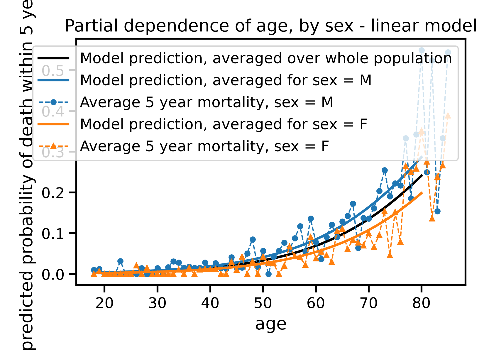
What we see is that the model appears a bit as a “smoother” compared to the bin-wise average observed mortality. This is a good picture to have in mind for machine learning.
This “smoothing” is a tradeoff to have in mind. More smoothing removes noise, but can also remove useful trends.
The non-linear model is more flexible, and can capture more complex trends, but it can also capture more noise (overfitting).
For the non-linear model#
pd_population_nonlinear = partial_dependence(model_nonlinear, X_test, features=["age"], grid_resolution=30)

plt.plot(pd_population_nonlinear["grid_values"][0], pd_population_nonlinear["average"][0],
        color="black", linewidth=2, label="Model prediction, averaged over whole population")

for sex_value in ["M", "F"]:
    is_sex = X_test["sex"] == sex_value
    pd_sex_nonlinear = partial_dependence(model_nonlinear, X_test[is_sex], features=["age"], grid_resolution=30)
    plt.plot(pd_sex_nonlinear["grid_values"][0], pd_sex_nonlinear["average"][0],
            color=sex_colors[sex_value], linewidth=2,
            label=f"Model prediction, averaged for sex = {sex_value}")
    age_sex_mean = (
        pd.DataFrame({"age": X_test.loc[is_sex, "age"], "y_test": y_test[is_sex]})
        .groupby("age", as_index=False)["y_test"].mean()
    )
    plt.plot(age_sex_mean["age"], age_sex_mean["y_test"],
            color=sex_colors[sex_value], linewidth=1, linestyle="--", marker=sex_markers[sex_value], markersize=4,
            label=f"Average 5 year mortality, sex = {sex_value}")

plt.xlabel("age")
plt.ylabel("predicted probability of death within 5 years")
plt.title("Partial dependence of age, by sex - non-linear model")
plt.legend()
plt.tight_layout()
plt.show()
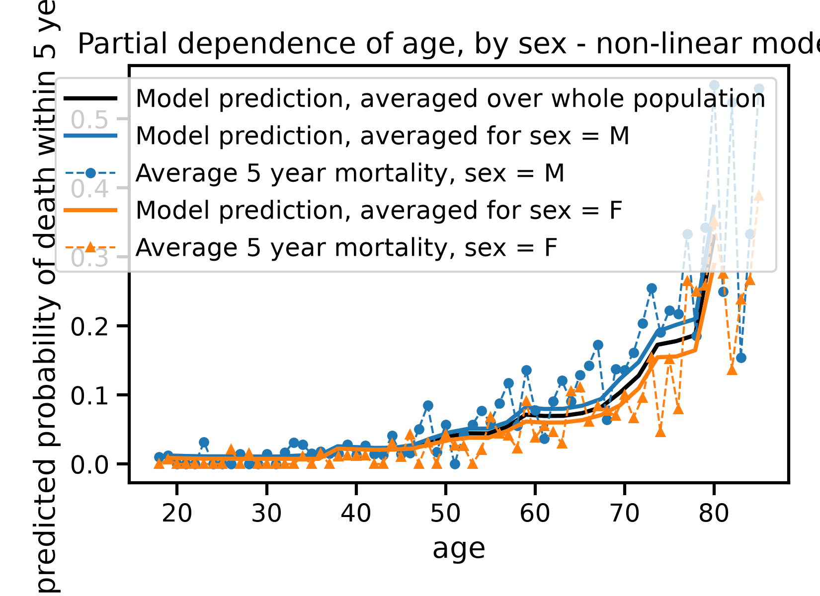
The non-linear model’s curve is close to the linear one here: with age as the single dominant predictor of mortality, there is little non-linear structure left to gain from extra flexibility.
Note that the data here is designed around a 5-year horizon. As such it sidesteps a challenge: censoring. The survival analysis notebook revisits this same dataset to get a full time-to-event answer instead, using every participant’s actual follow-up duration, however long or short.
Total running time of the script: (0 minutes 23.274 seconds)

