
Note
Go to the end to download the full example code or to run this example in your browser via JupyterLite or Binder.
Covariate shift: when the deployment population differs#
A model is often developed on one population (the “study” population), then used to make predictions on a different population (the “target” population). If the two populations have a different distribution of covariates, but the same underlying relationship between covariates and outcome, this is called covariate shift. It is one of the most common ways a machine-learning risk score breaks once it leaves the population it was built on - see Dockès, Varoquaux and Poline (2021), “Preventing dataset shift from breaking machine learning biomarkers”, GigaScience, for a general discussion of this failure mode.
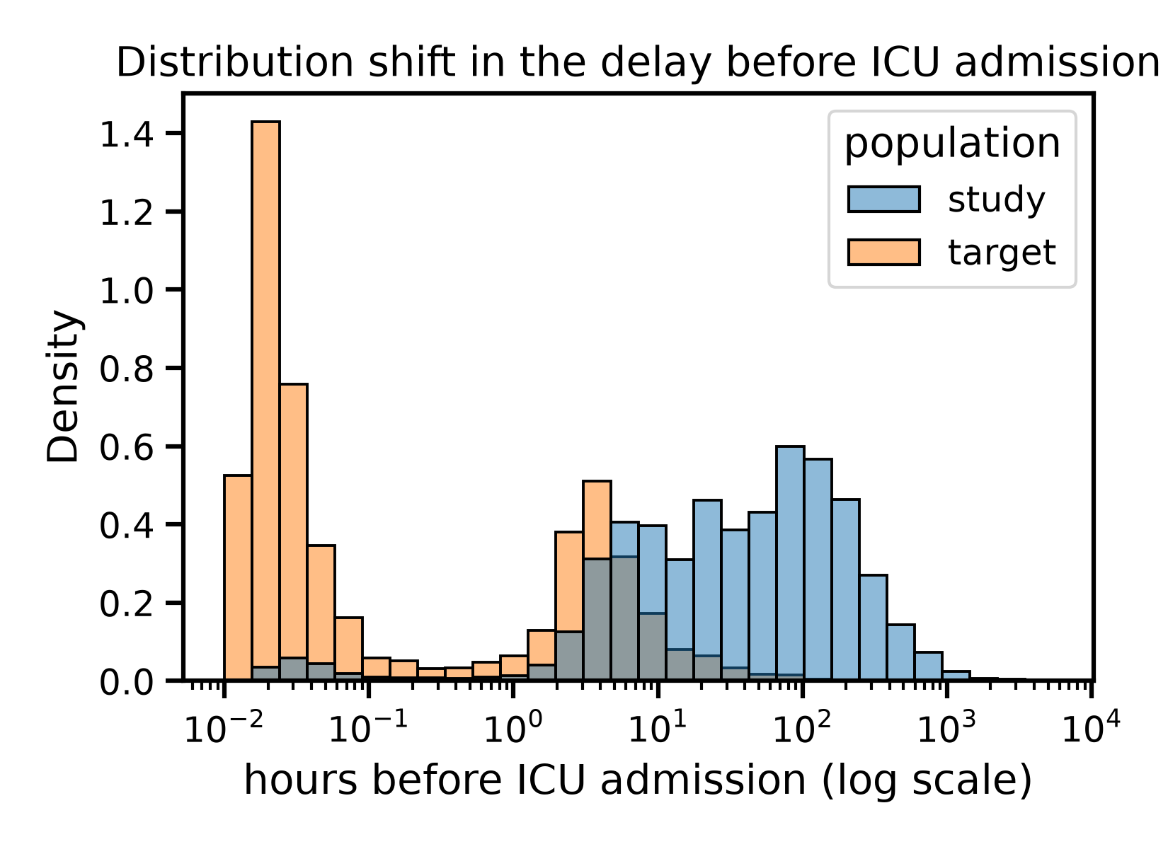
Here, we simulate a covariate shift on the PhysioNet sepsis data: a “study” population, covering a broad range of admission delays but dominated by patients admitted to the ICU only after a while on the ward, and a “target” population, dominated by patients admitted to the ICU right away - a plausible scenario when deploying a model developed on one hospital’s mixed case load to a unit that mostly receives direct ICU admissions. We show that a linear model, that looks reasonable on the study population, ranks patients worse than chance on the target population, while a non-linear model does not degrade at all.
Learning objectives and take home messages#
If the target population is a mere subsampling of the study population but the link between X and y is preserved, this is known as a “covariate shift” setting. Good performance on the target population can be achieved with a very flexible model, which then requires a lot of data in the study population. Not that, as we’ll see in the following notebooks, this is not a universal recipe, as not every distribution shift is a covariates shift.
Reference: Dockès, J., Varoquaux, G., & Poline, J. B. (2021). Preventing dataset shift from breaking machine-learning biomarkers. GigaScience, 10(9), giab055. https://doi.org/10.1093/gigascience/giab055
Load the data#
import pandas as pd

df = pd.read_csv("physionet_sepsis.csv")
df = df.dropna(subset=["hours_before_icu"])
Building a study and a target population#
We give every patient a “lateness” score between 0 (admitted to the
ICU right away) and 1 (admitted very late), based on their rank on
hours_before_icu. We then draw:
a “study” population, weighted towards late ICU admission (high lateness), but with no patient excluded outright
a “target” population, drawn from the remaining patients, weighted towards early ICU admission (low lateness)
This is a soft shift: both populations cover the whole range of admission delays, they are just weighted very differently, so they still overlap.
lateness = 1 - df["hours_before_icu"].rank(pct=True)

study_weight = lateness ** 2
study = df.sample(n=15000, weights=study_weight, random_state=0)

remaining = df.drop(study.index)
target_weight = (1 - lateness.loc[remaining.index]) ** 2
target = remaining.sample(n=8000, weights=target_weight, random_state=0)

study = study.copy()
target = target.copy()
study["population"] = "study"
target["population"] = "target"
Visualizing the shift#
The delay before ICU admission is shifted markedly between the two populations, but they still overlap: some study patients are admitted early, and some target patients are admitted late.
Admission delays span from minutes to months, so we plot them on a
log scale, as delay_hours, the number of hours before ICU
admission (the sign of hours_before_icu flipped, so that a longer
delay is a larger positive number). A log scale needs strictly
positive values, so the small fraction of patients whose recorded ICU
admission coincided with, or preceded, their hospital admission are
left out of this plot only.
import matplotlib.pyplot as plt
import seaborn as sns

both = pd.concat([study, target])
both["delay_hours"] = -both["hours_before_icu"]
both_with_positive_delay = both[both["delay_hours"] > 0]

plt.figure()
sns.histplot(
    data=both_with_positive_delay, x="delay_hours", hue="population",
    stat="density", common_norm=False, bins=30, log_scale=True,
)
plt.xlabel("hours before ICU admission (log scale)")
plt.title("Distribution shift in the delay before ICU admission")
plt.tight_layout()
plt.show()
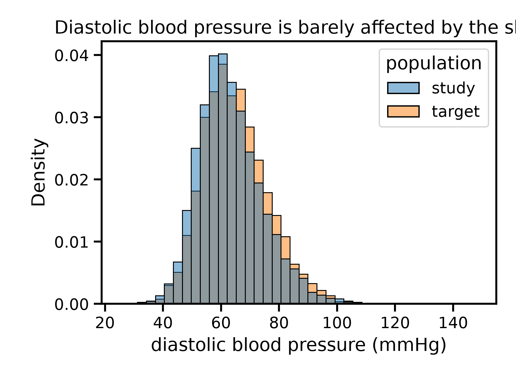
The other covariates are almost unaffected by the shift - this is a shift in one covariate, not a wholesale change of population.
plt.figure()
sns.histplot(
    data=both, x="diastolic_bp_mmhg", hue="population",
    stat="density", common_norm=False, bins=40,
)
plt.xlabel("diastolic blood pressure (mmHg)")
plt.title("Diastolic blood pressure is barely affected by the shift")
plt.tight_layout()
plt.show()
Model fitting and prediction#
We fit both models on the study population only, keeping a held-out study test set: this lets us check that the models generalize within the study population, before checking how well they generalize to the target population.
from sklearn.model_selection import train_test_split

X_study = study.drop(columns=["sepsis", "population"])
y_study = study["sepsis"]
X_target = target.drop(columns=["sepsis", "population"])
y_target = target["sepsis"]

X_study_train, X_study_test, y_study_train, y_study_test = train_test_split(
    X_study, y_study, test_size=0.3, stratify=y_study, random_state=0
)
Fit a linear model: logistic regression
from sklearn.linear_model import LogisticRegression
from skrub import tabular_pipeline

model_linear = tabular_pipeline(LogisticRegression())
model_linear.fit(X_study_train, y_study_train)
Fit a non-linear model: gradient boosting
model_nonlinear = tabular_pipeline("classifier")
model_nonlinear.fit(X_study_train, y_study_train)
Comparing predicted and observed risk, on both populations#
We first look at AUC, which measures how well a model ranks patients by risk.
from sklearn.metrics import roc_auc_score

y_pred_linear_study = model_linear.predict_proba(X_study_test)[:, 1]
y_pred_linear_target = model_linear.predict_proba(X_target)[:, 1]

y_pred_nonlinear_study = model_nonlinear.predict_proba(X_study_test)[:, 1]
y_pred_nonlinear_target = model_nonlinear.predict_proba(X_target)[:, 1]

auc_comparison = pd.DataFrame({
    "population": ["study", "target", "study", "target"],
    "model": ["linear", "linear", "non-linear", "non-linear"],
    "auc": [
        roc_auc_score(y_study_test, y_pred_linear_study),
        roc_auc_score(y_target, y_pred_linear_target),
        roc_auc_score(y_study_test, y_pred_nonlinear_study),
        roc_auc_score(y_target, y_pred_nonlinear_target),
    ],
})
print(auc_comparison.to_string(index=False))
population      model      auc
     study     linear 0.592481
    target     linear 0.496090
     study non-linear 0.594094
    target non-linear 0.573349
The message is unambiguous. The linear model’s AUC drops from an already mediocre 0.59 on the study population to 0.50 on the target population - pure chance, it no longer ranks patients better than a coin flip. The non-linear model’s AUC does not drop at all: from one run to the next it fluctuates a little (gradient boosting is not seeded here), but it stays in the same 0.55-0.6 range on both populations - no systematic degradation.
AUC only checks the ranking of predictions, though. Rather than a ranking metric, we can also compare the average predicted risk to the average observed sepsis rate: this is exactly what a covariate shift can break, even for a model that still ranks patients correctly.
comparison = pd.DataFrame({
    "population": ["study", "target", "study", "target"],
    "model": ["linear", "linear", "non-linear", "non-linear"],
    "observed_sepsis_rate": [
        y_study_test.mean(), y_target.mean(),
        y_study_test.mean(), y_target.mean(),
    ],
    "predicted_sepsis_rate": [
        y_pred_linear_study.mean(), y_pred_linear_target.mean(),
        y_pred_nonlinear_study.mean(), y_pred_nonlinear_target.mean(),
    ],
})
print(comparison.to_string(index=False))
population      model  observed_sepsis_rate  predicted_sepsis_rate
     study     linear              0.039556               0.039714
    target     linear              0.050125               0.029501
     study non-linear              0.039556               0.039831
    target non-linear              0.050125               0.044028
On the study population, both models predict a risk close to the observed one. On the target population, the linear model’s predicted risk drops noticeably below the actual observed rate, while the non-linear model’s predicted risk stays much closer to it.
Partial dependence: why the linear model fails to generalize#
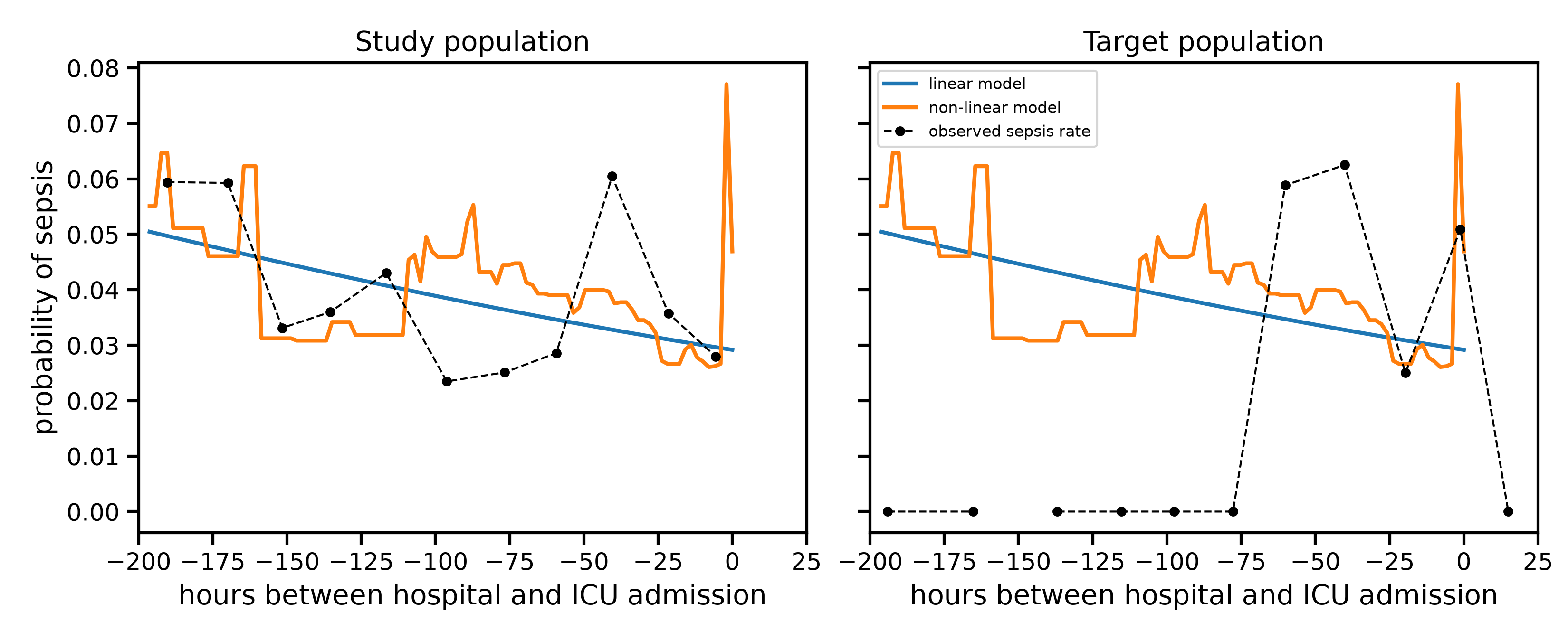
We plot, for each population, the two models’ partial dependence on the delay before ICU admission (both fit once, on the study population only), next to the observed sepsis rate actually measured in that population. Since the delay is a near-continuous measurement, we group it into 12 bins of equal size before averaging observed rates.
import numpy as np
from sklearn.inspection import partial_dependence

# A fixed grid, shared by both populations, covering the range where
# most of the study population lies. Using the same grid for both
# panels, rather than letting each pick its own range, makes the two
# panels directly comparable.
delay_grid = np.linspace(-200, 25, 50)
delay_bin_edges = np.linspace(-200, 25, 13)

grid_background = pd.concat([X_study_test, X_target])
pd_linear = partial_dependence(
    model_linear, grid_background, features=["hours_before_icu"],
    custom_values={0: delay_grid},
)
pd_nonlinear = partial_dependence(
    model_nonlinear, grid_background, features=["hours_before_icu"],
    custom_values={0: delay_grid},
)

population_names = ["study", "target"]
population_X = [X_study_test, X_target]
population_y = [y_study_test, y_target]

fig, axes = plt.subplots(1, 2, figsize=(11, 4.5), sharey=True)

for i in range(2):
    ax = axes[i]
    population_name = population_names[i]
    X_population = population_X[i]
    y_population = population_y[i]

    ax.plot(pd_linear["grid_values"][0], pd_linear["average"][0],
            linewidth=2, label="linear model")
    ax.plot(pd_nonlinear["grid_values"][0], pd_nonlinear["average"][0],
            linewidth=2, label="non-linear model")

    observed = pd.DataFrame({
        "hours_before_icu": X_population["hours_before_icu"],
        "sepsis": y_population.values,
    })
    observed["delay_bin"] = pd.cut(observed["hours_before_icu"], bins=delay_bin_edges)
    observed_by_bin = observed.groupby("delay_bin")[["hours_before_icu", "sepsis"]].mean()
    ax.plot(observed_by_bin["hours_before_icu"], observed_by_bin["sepsis"],
            color="black", linewidth=1, linestyle="--", marker="o", markersize=4,
            label="observed sepsis rate")

    ax.set_xlim(-200, 25)
    ax.set_xlabel("hours between hospital and ICU admission")
    ax.set_title(f"{population_name.capitalize()} population")

axes[0].set_ylabel("probability of sepsis")
axes[1].legend(fontsize=8)
fig.tight_layout()
plt.show()
/home/runner/work/health_ml_tutorial/health_ml_tutorial/examples/04_covariate_shift.py:279: FutureWarning: The default of observed=False is deprecated and will be changed to True in a future version of pandas. Pass observed=False to retain current behavior or observed=True to adopt the future default and silence this warning.
  observed_by_bin = observed.groupby("delay_bin")[["hours_before_icu", "sepsis"]].mean()
/home/runner/work/health_ml_tutorial/health_ml_tutorial/examples/04_covariate_shift.py:279: FutureWarning: The default of observed=False is deprecated and will be changed to True in a future version of pandas. Pass observed=False to retain current behavior or observed=True to adopt the future default and silence this warning.
  observed_by_bin = observed.groupby("delay_bin")[["hours_before_icu", "sepsis"]].mean()
On the study population (left), admission delays are spread across the whole range, and the observed rate has real structure: broadly elevated for long delays, then rising sharply again for the most immediate admissions - probably because a patient who goes straight to the ICU is often already the sickest on arrival. The non-linear model picks up that closing spike; the linear model, fit to an overall decreasing trend, cannot represent it and instead keeps decreasing towards zero delay.
On the target population (right), admission delays cluster right where that spike is. The linear model’s decreasing line predicts its lowest risk exactly where the true risk is highest, which is why its ranking of patients collapses to chance level. The non-linear model, having already learned that spike from the study population, keeps recognizing it in the target population just as well.
This is the essence of covariate shift: nothing changed in how admission delay relates to sepsis risk, only how often each delay is observed. A model whose functional form cannot represent the true relationship can look fine while deployment data covers a wide range of values, and still fail sharply once deployment data concentrates on the one region where that misrepresentation matters most.
A flexible enough model was all it took to fix this, because the link between covariates and outcome itself never changed. The next notebooks turn to biases where that is no longer true, and no amount of model flexibility or data can fix things on its own.
Total running time of the script: (0 minutes 7.227 seconds)

