
Note
Go to the end to download the full example code or to run this example in your browser via JupyterLite or Binder.
Indication bias: challenge in reasonning on interventions#
In health we often want to do more than mere prediction: we would like to
intervene, change something on the patient or the care, to improve a
health outcome. In example 02 and 04, hours_before_icu - the delay
between hospital and ICU admission - was just a feature we predicted
sepsis from. Here we ask a genuinely different question: hospitals build
“rapid response” protocols specifically to shorten this delay, so if we
intervened to get patients to the ICU faster, would that reduce their
risk of sepsis?
Patients are not randomly assigned a delay, though. How quickly a patient is escalated to the ICU depends on how sick they already look on the ward - and that same underlying sickness independently drives sepsis risk. This mismatch, where the reason a patient gets (or doesn’t get) a treatment is itself tangled up with their prognosis, is called indication bias (or confounding by indication). It is unlike a randomized trial, where who gets the treatment is decided by a coin flip.
Unlike the earlier examples, everything here is real: the delay before ICU admission and the sepsis outcome are both taken as recorded, with nothing simulated. This means we have no known “true effect” to check our answer against - exactly the situation we are in with any real observational health data. What we can still show is that some ways of answering the question are self-contradictory or implausible, and that more careful ones at least remove the most obvious contradictions.
Learning objectives and take home messages#
Reasonning on interventions requires to contrast the outcome predict by the model in the two potential scenarios that underpin the putative intervention: counterfactual reasonning. The challenge is that the model has likely been trained in settings where the two scenarios are applied to different populations that are not comparable (eg treatment given only to more sick individuals). Valid counterfactual reasonning requires a set of covariates sufficient to explain out this difference, accounting for the baseline (capturing the complete set of counfounding effects). In addition a good model must then predict well both treated and untreated outome, which is a different error to control than a standard predictive model.
Reading Useful big-picture reading: Abécassis, J., Dumas, É., Alberge, J., & Varoquaux, G. (2025). From prediction to prescription: Machine learning and causal inference for the heterogeneous treatment effect. Annual Review of Biomedical Data Science, 8. https://doi.org/10.1146/annurev-biodatasci-103123-095750
Load the data#
We reuse hours_before_icu from the PhysioNet sepsis data, flipped
in sign into delay (a positive number of hours), together with the
real sepsis outcome and the same vitals used to predict sepsis in
example 02.
import pandas as pd

df = pd.read_csv("physionet_sepsis_causal.csv")
covariate_columns = [
    "age", "sex", "heart_rate_bpm", "resp_rate", "temp_celsius",
    "mean_arterial_bp_mmhg", "o2_sat_pct", "wbc_count", "creatinine_mgdl",
]
df = df.dropna(subset=covariate_columns + ["hours_before_icu"])
df["delay"] = -df["hours_before_icu"]

print(df[["delay", "sepsis"]].describe())
              delay        sepsis
count  34253.000000  34253.000000
mean      51.883880      0.042595
std      132.171483      0.201945
min      -23.990000      0.000000
25%        0.040000      0.000000
50%        6.580000      0.000000
75%       46.120000      0.000000
max     3710.660000      1.000000
The raw pattern: sepsis rate across the delay before ICU admission#
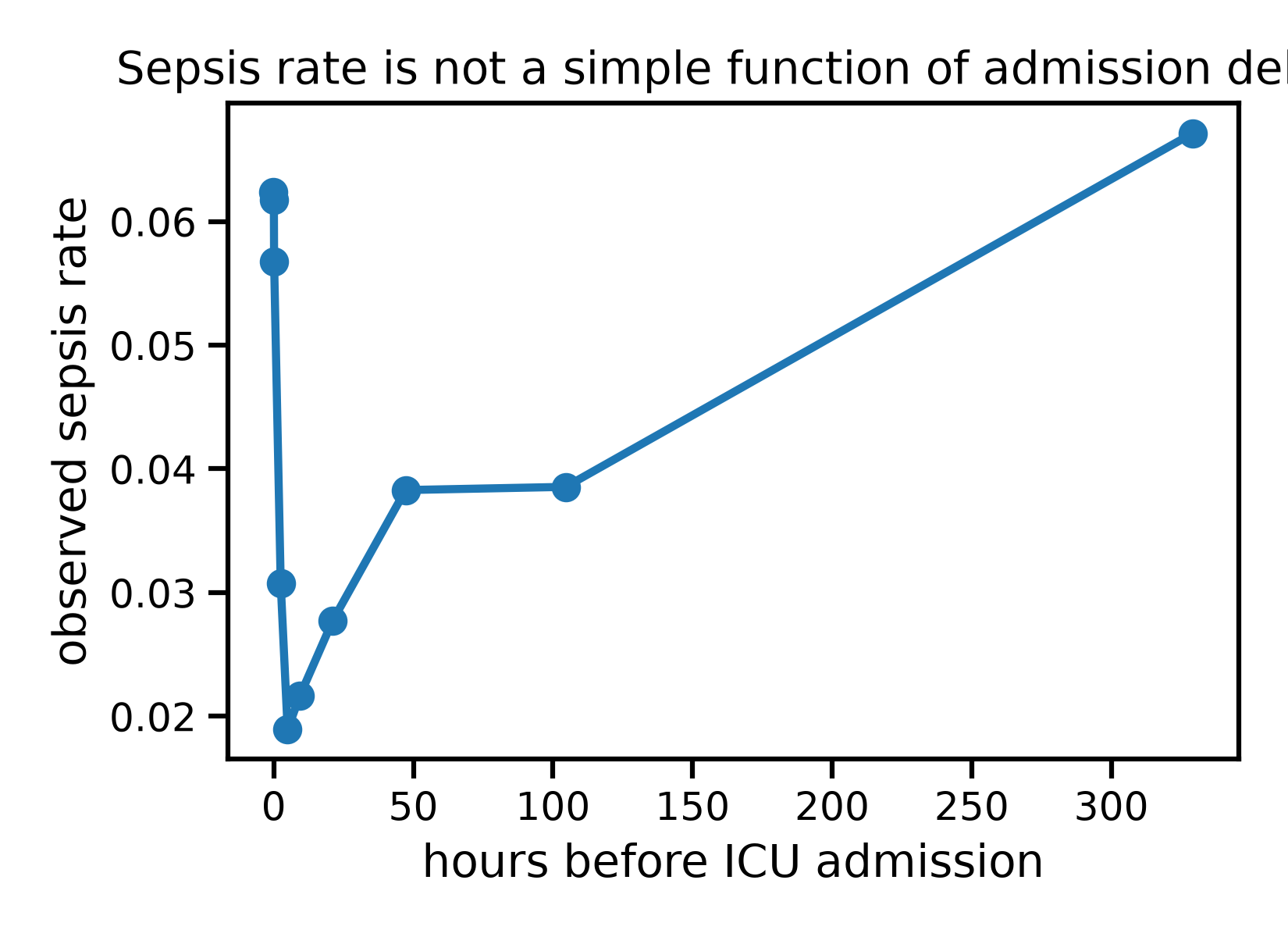
We split patients into ten equal-sized groups (deciles) of delay,
and look at the observed sepsis rate in each group.
df["delay_decile"] = pd.qcut(df["delay"], 10, duplicates="drop")
rate_by_decile = df.groupby("delay_decile", observed=True)[["delay", "sepsis"]].mean()
print(rate_by_decile)

import matplotlib.pyplot as plt

plt.figure()
plt.plot(rate_by_decile["delay"], rate_by_decile["sepsis"], marker="o")
plt.xlabel("hours before ICU admission")
plt.ylabel("observed sepsis rate")
plt.title("Sepsis rate is not a simple function of admission delay")
plt.tight_layout()
plt.show()
                         delay    sepsis
delay_decile
(-23.991, 0.02]      -0.072066  0.062339
(0.02, 0.03]          0.030000  0.061757
(0.03, 0.63]          0.114496  0.056744
(0.63, 3.658]         2.483886  0.030729
(3.658, 6.58]         4.961532  0.018928
(6.58, 13.21]         9.317632  0.021637
(13.21, 29.2]        21.140855  0.027737
(29.2, 70.746]       47.210371  0.038282
(70.746, 148.328]   104.555340  0.038540
(148.328, 3710.66]  329.192685  0.067134
The pattern is not what a simple “the longer the delay, the worse” story would predict: sepsis rate is elevated for the longest delays, dips for intermediate ones, and rises sharply again for patients admitted to the ICU almost immediately. Before jumping to conclusions about cause and effect, we should ask whether this pattern reflects what delay does to patients, or simply reflects who ends up with each delay.
The naive way: comparing patients admitted quickly to those admitted slowly#
The simplest possible analysis to answer “does a shorter delay reduce sepsis risk” is to split patients into “fast” and “slow” groups around some cutoff, and compare their sepsis rates directly - the equivalent of a difference in means for a continuous exposure.
thresholds = [3, 12, 24]

naive_estimates = []
for threshold in thresholds:
    fast = df["delay"] <= threshold
    rate_fast = df.loc[fast, "sepsis"].mean()
    rate_slow = df.loc[~fast, "sepsis"].mean()
    naive_estimates.append(rate_fast - rate_slow)
    print(
        f"cutoff={threshold:2d}h   "
        f"sepsis rate if fast={rate_fast:.4f}   "
        f"sepsis rate if slow={rate_slow:.4f}   "
        f"naive difference={rate_fast - rate_slow:+.4f}"
    )
cutoff= 3h   sepsis rate if fast=0.0568   sepsis rate if slow=0.0344   naive difference=+0.0224
cutoff=12h   sepsis rate if fast=0.0425   sepsis rate if slow=0.0427   naive difference=-0.0001
cutoff=24h   sepsis rate if fast=0.0408   sepsis rate if slow=0.0463   naive difference=-0.0055
The naive estimate tell us that:
With a 3h cutoff, “fast” patients look worse off than “slow” ones.
With a 24h cutoff, the sign flips: “fast” patients now look better off.
- A real effect of shortening delay should not change sign
depending on where we happen to draw an arbitrary line. This instability is itself strong evidence that the naive comparison is not measuring a causal effect of delay, but rather picking up who ends up in each group.
The clinical intuition matches this: patients rushed straight to the ICU are often recognized as critically ill from the very first minute, which drives risk up on its own; patients left on the ward a long time may be exactly those whose deterioration was harder to catch early. Both patterns tangle up “how fast a patient reached the ICU” with “how sick they already were” - indication bias, acting in both directions at once.
Adjusting with a predictive model: which model matters#
Rather than collapsing delay into two groups, we can model sepsis
from the vitals and the delay, then ask the model to predict sepsis
risk for every patient at several hypothetical delays, keeping their
own vitals fixed. Averaging these counterfactual predictions traces
out a dose-response curve: what sepsis risk would look like, patient
by patient, if delay had been some given value instead of what it
actually was. This is the idea of the “G-formula” applied to a
continuous exposure (or “treatment”), strongly related to the
partial_dependence tool used in examples 02 and 04.
import numpy as np
from sklearn.inspection import partial_dependence
from sklearn.ensemble import HistGradientBoostingClassifier
from sklearn.linear_model import LogisticRegression
from skrub import tabular_pipeline

X = df[covariate_columns].copy()
X["delay"] = df["delay"]
y = df["sepsis"]

delay_grid = np.linspace(0, 300, 40)

model_linear = tabular_pipeline(LogisticRegression(max_iter=1000))
model_linear.fit(X, y)
pd_linear = partial_dependence(model_linear, X, features=["delay"], custom_values={0: delay_grid})

model_flexible = tabular_pipeline(HistGradientBoostingClassifier(random_state=0))
model_flexible.fit(X, y)
pd_flexible = partial_dependence(model_flexible, X, features=["delay"], custom_values={0: delay_grid})

plt.figure()
plt.plot(
    rate_by_decile["delay"], rate_by_decile["sepsis"],
    color="black", linestyle="--", marker="o", markersize=4, label="raw observed rate",
)
plt.plot(pd_linear["grid_values"][0], pd_linear["average"][0], label="adjusted, logistic regression")
plt.plot(pd_flexible["grid_values"][0], pd_flexible["average"][0], label="adjusted, gradient boosting")
plt.xlabel("hours before ICU admission")
plt.ylabel("sepsis rate / predicted sepsis probability")
plt.title("Adjusting for vitals:\nthe model's flexibility changes the answer")
plt.legend()
plt.tight_layout()
plt.show()
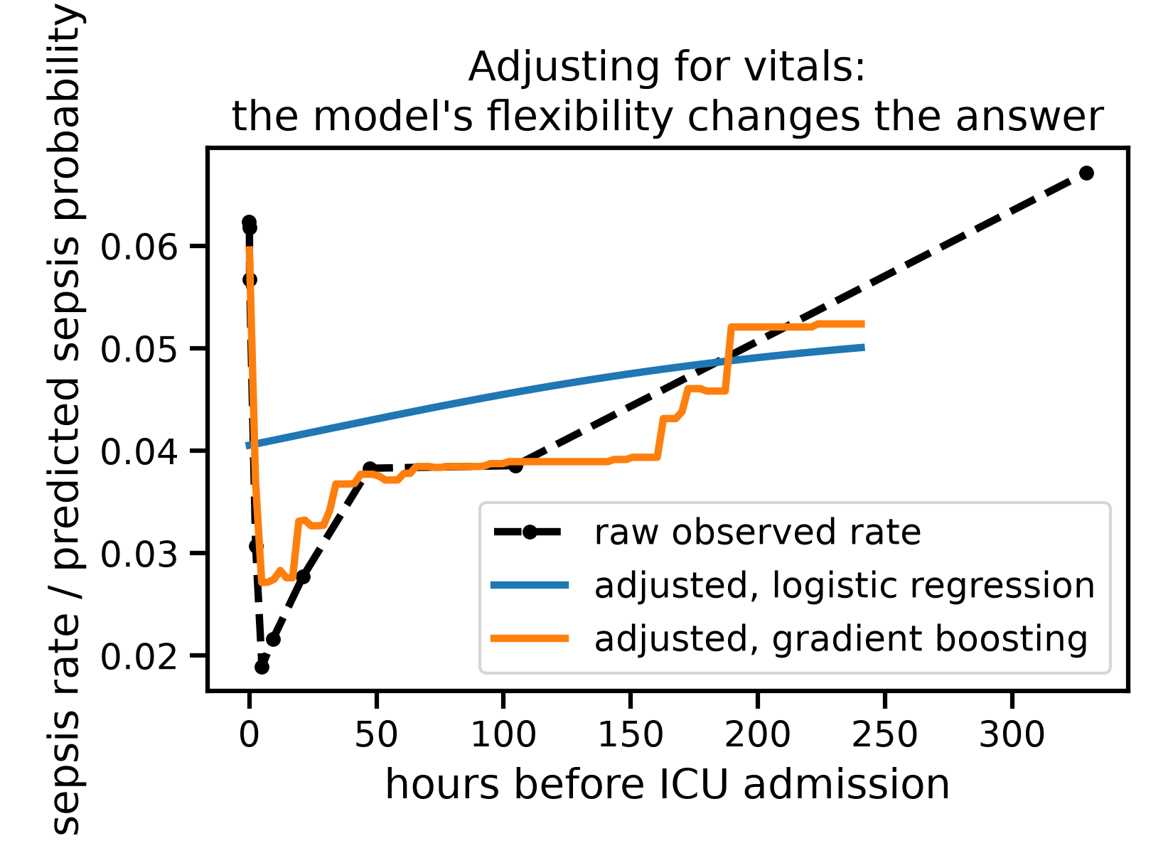
The naive, linear adjustment is almost featureless: it suggests sepsis risk creeps up only slowly and smoothly with delay, missing the elevated risk of immediate admissions entirely. Used to guide policy, it would suggest there is nothing urgent about patients rushed straight to the ICU - exactly the group the raw data flags as highest-risk.
The flexible model, adjusting for the same vitals, tells a more nuanced story: risk for the very long delays drops noticeably once we account for how sick these patients’ vitals already were, but the risk for immediate admissions barely moves. In other words, our six vitals explain away part of why long delays look risky, but not why immediate admissions do. This does not prove shortening delay would help these patients - it only shows that whatever elevates their risk is not (fully) captured by the vitals we adjusted for. A linear model would never have revealed this distinction at all.
This mirrors the exact lesson from examples 02 and 04: a model that cannot represent a non-linear relationship will get it wrong, silently. Here the stakes are higher than prediction accuracy - a wrong model leads to a wrong policy conclusion.
Model selection for causal reasoning#
Choosing between the two models above is not just a matter of taking the one that predicts best on observed data: a model also needs to extrapolate well from patients admitted fast to what patients admitted slowly would have looked like, and vice-versa - an error we have no direct way to check, since we never observe both outcomes for the same patient.
Reference This is precisely the challenge described in Doutreligne and Varoquaux (2025), “How to select predictive models for decision-making or causal inference”, GigaScience: https://doi.org/10.1093/gigascience/giaf016 - predictive accuracy on the observed outcome does not, by itself, tell us which model to trust for a causal question.
An causal estimator: inverse probability weighting#
A different strategy models who becomes “fast” or “slow” rather than the outcome. We reuse the 3h cutoff from the naive comparison above, and estimate each patient’s probability of falling in the “fast” group from their vitals - their propensity score - then reweight patients by the inverse of that probability, so that comparable “fast” and “slow” patients count for more.
df["fast"] = (df["delay"] <= 3).astype(int)

propensity_pipeline = tabular_pipeline(HistGradientBoostingClassifier(random_state=0))
propensity_pipeline.fit(df[covariate_columns], df["fast"])
propensity_score = propensity_pipeline.predict_proba(df[covariate_columns])[:, 1]
propensity_score = np.clip(propensity_score, 0.02, 0.98)

plt.figure()
plt.hist(propensity_score[df["fast"] == 0], bins=40, density=True, alpha=0.6, label="slow")
plt.hist(propensity_score[df["fast"] == 1], bins=40, density=True, alpha=0.6, label="fast")
plt.xlabel("estimated propensity of being admitted fast")
plt.ylabel("density")
plt.title("Overlap between the fast and slow groups'\n propensity scores")
plt.legend()
plt.tight_layout()
plt.show()
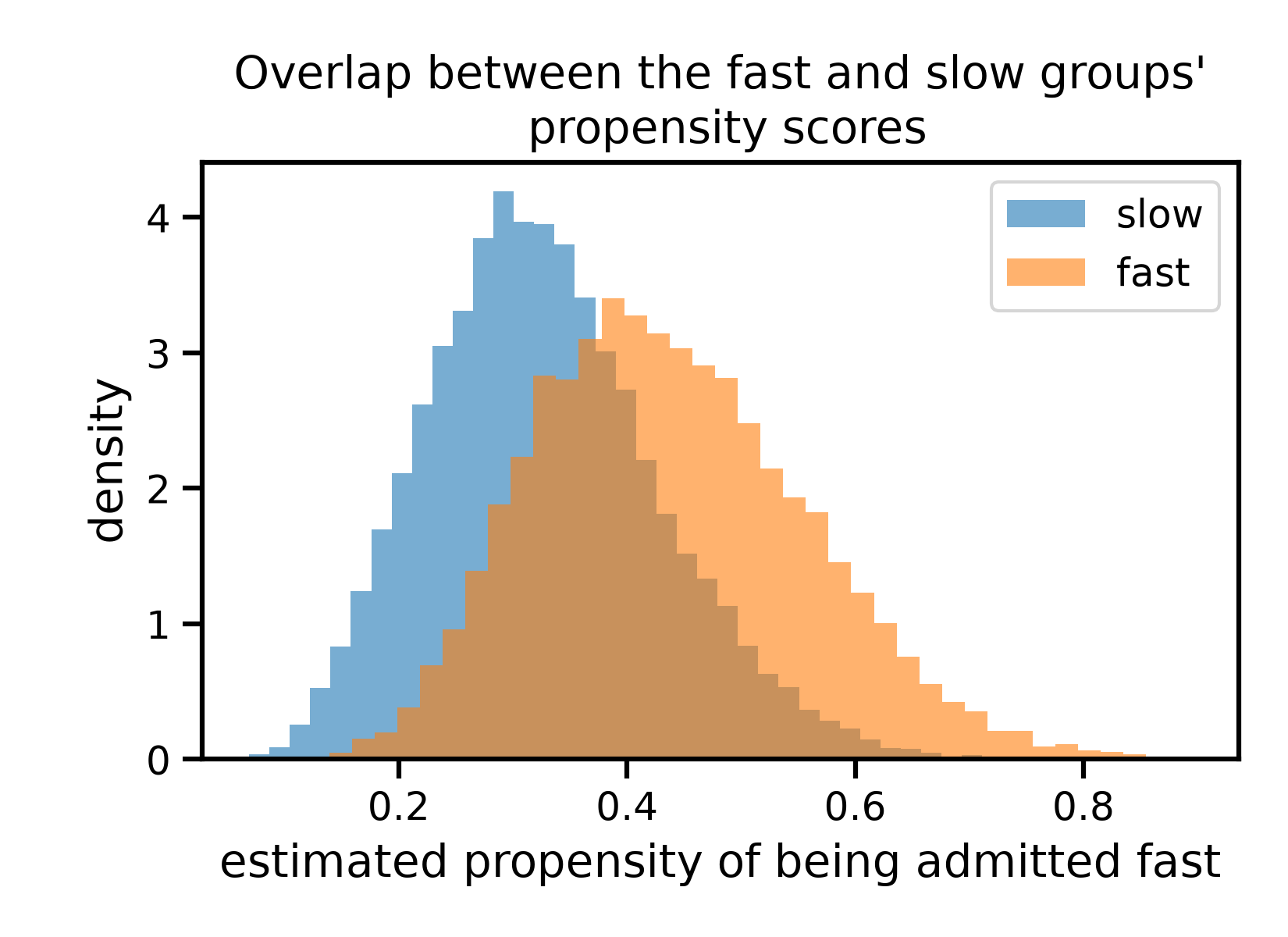
The two distributions overlap substantially, though “fast” patients skew towards higher propensity scores, as expected: our vitals do carry some information about who ends up admitted quickly, just not a lot.
naive_3h = df.loc[df["fast"] == 1, "sepsis"].mean() - df.loc[df["fast"] == 0, "sepsis"].mean()
ipw_effect = np.mean(
    df["fast"] * df["sepsis"] / propensity_score
    - (1 - df["fast"]) * df["sepsis"] / (1 - propensity_score)
)
print(f"Naive difference (3h cutoff):    {naive_3h:+.4f}")
print(f"Inverse probability weighting:   {ipw_effect:+.4f}")
Naive difference (3h cutoff):    +0.0224
Inverse probability weighting:   +0.0183
Weighting shrinks the estimate a little, but nowhere near to zero: it only partially agrees with the naive comparison. This is an important, easy to miss limitation of adjustment: it can only correct for confounding that is both measured and strong enough for a model to detect in the covariates we give it. Here, whatever decides how fast a patient reaches the ICU - ward staffing at that hour, how the case presented, hospital protocol - is only partly visible to the six vitals we used, so a meaningful part of the naive gap survives even after weighting.
Put together with the dose-response curves above, the honest conclusion is not “we have found the true effect of delay on sepsis”. It is that the naive comparison is self-contradictory, that a flexible outcome model uncovers structure a linear one cannot see, and that our adjustment - by any method - is only as good as the confounders we actually measured.
Total running time of the script: (0 minutes 16.787 seconds)

