
This page gives some advices and examples on making posters for scientific conference.
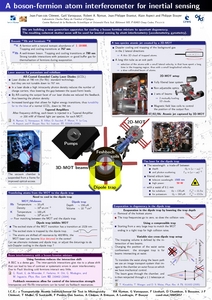
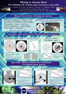
Here are some posters I made (one in 2007, the other in 2011). They don’t follow all the advice on this page, but should.
LaTeX sources
This poster is written in LaTeX. You can download the whole source of the posters for the first poster (left), and the second one (right). These are some of my personnal projects, not meant for sharing. As a result they have a fair amount of hacking. I have been asked for source code more than once, so I put it on the web. I do not however have time to provide any support for it (I am already to busy supporting other things. Any mail asking for help on these files will unanswered. Sorry.
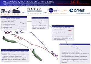
Here is another example, a bit more visually appealing, as it is intended for a less technical audience.
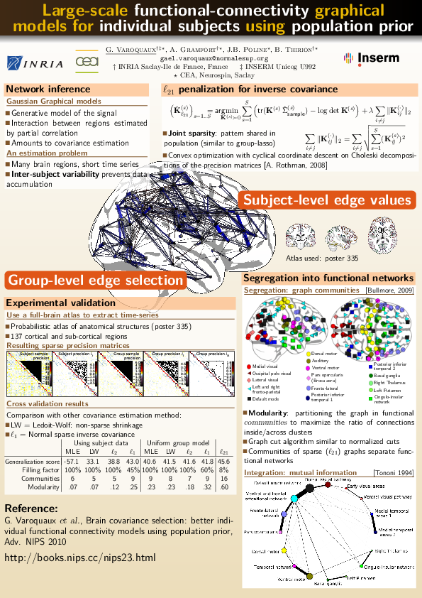
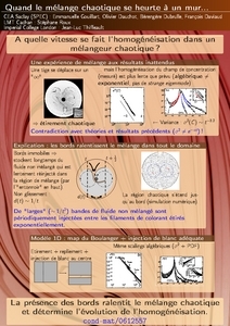
One more about my work: this one was made to convey a strong message and simplified the content a lot to get the message accross. I am not too sure it worked, but I still find the poster pretty.
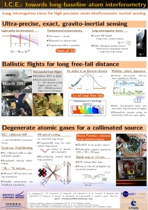
And finally two made by Emmanuelle with really nice colours.
Advice on poster presentation
See also http://www.ncsu.edu/project/posters
Fonts
Sans-serif fonts look really nice, but are less readable in paragraphs. Use them for titles and headers. Use serif fonts for paragraphs. Stick to a simple font family like times. Use bold fonts when writing with a light colour on a dark background.
Colours
Stick to a rather little numbers of colours, but well chosen. Put a very light colour behind your text blocks. If ink is not too expensive, I would use a dark background, and have light text blocks on it. Have well separated areas of your posters (like the background, and the text blocks), and have the background, or other decorative elements, have little contrast: they should not stand out too much (mine stood out too much in my poster, its because the print-out didn’t look like want was on the screen).
Page layout
Break symmetry and order. A well aligned poster is boring to the eye, and does not catch attention from afar. People read your poster by first scanning through it and stopping at a few key points (usually first at the upper left, then the upper left, then down right, and down left), then they might read it more thoroughly after their first scan. You want to define visually these key points, make them appealing, and put key ideas there.
Long lines are difficult to read. Pick up a book, a flyer, anything made by a professional publisher, it will never have long lines. A good rule of thumb is that if a text block has lines longer than 80 characters, it needs breaking down in several columns.
Which software to use
Many people use PowerPoint to make their posters. It is easy to use, but it is not dedicated to making posters, and it does horrible pdfs.
If you want to pay a lot there is Quark Xpress that is very good for that kind of things. Adobe PageMaker is also a very good software. Xara is a cheap and good design program, and a free version will soon be available for linux.
I use LaTeX. Just because I love the way it positions characters. But I admit it is a bit brutal. What I would advice you to use is scribus it is dedicate to making posters and is free and open source. I sometimes use LaTeX to create the text boxes, and scribus to lay them around. I wrote a page describing how I do it.
One last remark: use vector graphics (eps, ps, pdf, svg), not bitmaps, they scale up really badly. Try to get a vector logo of your institution. Usually asking the PR people is the only thing it take to get one. Of course if you are using powerpoint chances are that you wont be able to insert it in your poster.